專欄
田修銓-與台東的緣分,是從參與熱氣球嘉年華與臺灣國際衝浪公開賽開始的
與台東的緣分,是從參與熱氣球嘉年華與臺灣國際衝浪公開賽開始的
My destiny with Taitung was determined when I participated in the Taiwan International Balloon Festival and the Taiwan Open of Surfing.
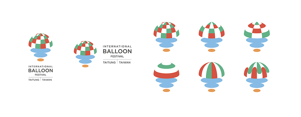
已在台東舉辦十年的熱氣球嘉年華,在第 11 年的時候,想把品牌建立的更完整。 發想的時候,考慮的是熱氣球的多樣性,要如何表現出來,於是設定了一個模組, 讓熱氣球可能可以每年還是有不同的變化,甚至是顏色的不同,都仍可識別出是 同一個脈絡的樣貌。
The balloon festival has been held in Taitung for ten years. In the 11th year, we wanted to build a more complete brand. We considered the diversity of hot air balloons. A module was set up so that the balloons could change from year to year, but can still be recognized in the same vein even if the colors were different.
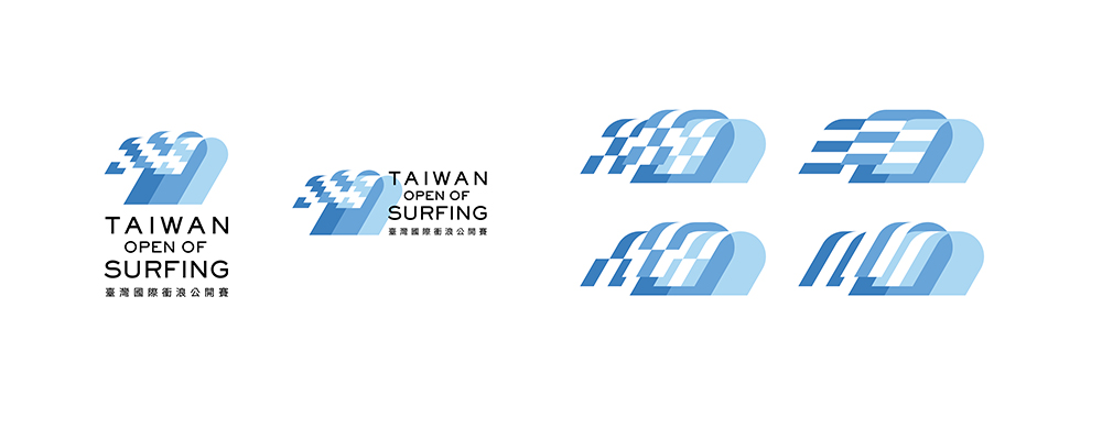
而衝浪節的部分,延伸這個脈絡,另一方面是想要在動態表現上,像是真的每次 浪出現的時候,每次產生的波紋,也不盡相同,若再配上一小節聲音的記憶,也 能加深其記憶與識別。
As for the surfing festival, we extended this vein. On the other hand, we wanted the dynamic performance to be like the slightly different ripples created by waves. Memory and recognition could also be deepened if supplemented by a small section of sound.
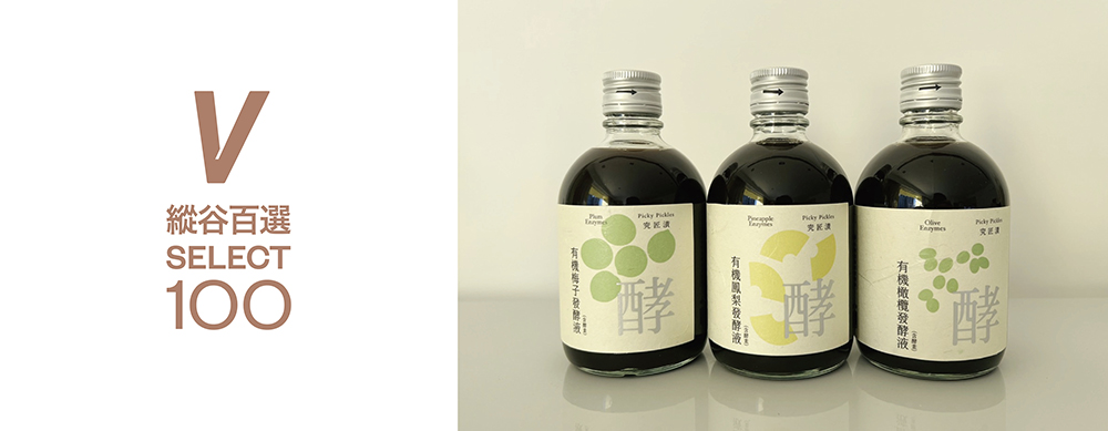
後來又因緣際會下參與了縱谷百選 V SELECT 100 的計畫,負責了其中幾家廠商幫 忙包裝上的改良或建議。有次在交流場合被人提及,很喜歡這個產出的結果,雖 然我也分不出來是不是客套話,但還是很開心!
Later, I participated in the V SELECT 100 project by chance. I was responsible for helping a few manufacturers improve packaging. I was once told at a social event that someone really liked the outcome of this product. Although I couldn't tell if it was a courtesy or not, I was still delighted!
最後是今年參與了臺東設計師週,一開始其實想要配對到的藝術家不是原本首選, 但其實只是想選自己比較有把握的,後來與山野牧人(木作及複合媒材加工)、 享想恭坊(藍染)合作,想說都踏出舒適圈了,就讓雙方也都踏出舒適圈,於是 變成三方一同合作的方式進行。
Finally, I participated in the Taitung Designer Week this year. In the beginning, the artists I wanted to match with were not my first choice. I just wanted to choose the ones I had more confidence in. Later, I collaborated with Field Herdsman (woodworking and mixed media processing) and Xiangxiang Gongfang (blue dyeing). Since I had stepped out of my comfort zone, I thought I should let us all do the same. So it became three-way cooperation.
將這個系列命名為 bluewaves,logo 也像是測試的木塊,由三方組合成臺東的 T 為發想。
This series was named bluewaves. The logo looked like a prototype wooden block. The idea was to form it like the T from Taitung.
一開始先測試了不同木頭與藍染次數的結果,最後選了衫木及楠木。製作了一系 列的臺東餐桌風景,想像在台東的海邊,與朋友一起品嚐台東山、海風景的滋味, 將台東藍運用在藍染與木頭的結果,像是鉛筆 2b、3b、4b 的方式分出色階,讓 品牌定義出一些規則,也讓之後想要下訂的人有跡可循。
We tested different woods and the number of times of blue dyeing at first, and we finally chose Chinese fir and Phoebe as the type of wood we would use. We have created a series of Taitung dining table scenery. Imagine savoring Taitung's mountains and sea scenery with friends at the seaside. We used Taitung blue in the blue dyeing and wood, and graded them with 2B, 3B, and 4B pencils. So that some rules could be defined on the brand and people who wanted to place orders could follow them.
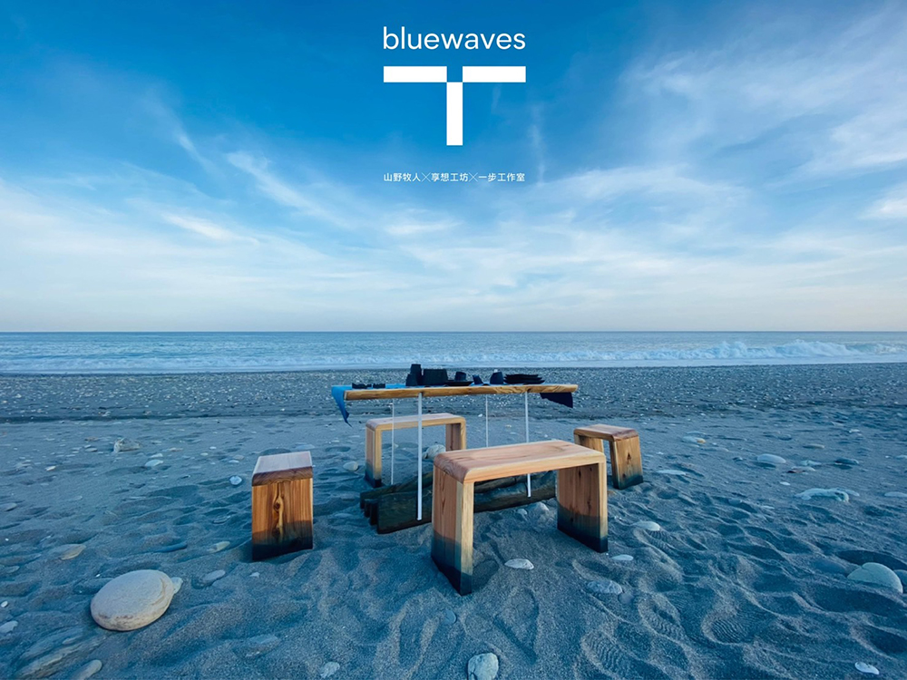
但實際測試後發現,木頭本身的條件,儘管是一樣的木材,可能因為天氣氣後或 存放時間長短等變因,有點不可控制,沒辦法達到預期想像的樣子。但儘管這樣, 都是成果的一部分,所以想和大家分享。
However, after actual testing, we found that the wood itself was a little uncontrollable due to the weather or the length of storage and other variables even though it was the same kind of wood. We could not achieve the expected imaginary look. Nevertheless, it was part of the result, so I want to share it with everyone.
每次來台東都可以感受到台東的好天氣,吸取了一些大自然的能量,帶回台北繼 續努力!
Every time I come to Taitung I can feel the great weather and absorb the energy of nature, bring them back to Taipei and keep up the hard work!
文/田修銓 NEILTIEN